Ski Resort Mobile App
UI/UX Design . Illustration . UI development & Animation

Ski Resort Mobile App
Montgenèvre ski resort is a mobile application that provides various services of Montgenèvre ski resort, such as delivering a complete forecast and weather report, different season’s activities and To-do ideas, maps and status information for trails and lifts. In addition to allowing users to book services and accommodation through the app.
In this presentation:The Problem
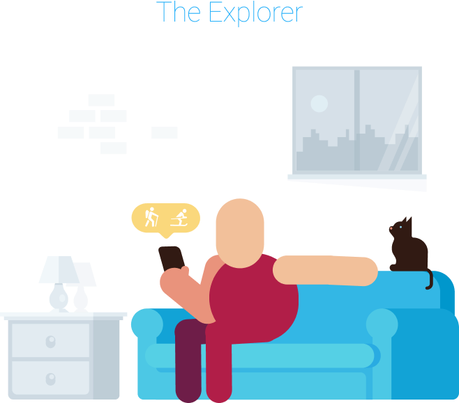
The main problem this app is trying to solve is that the importance of the different services varies depending on where the user is while using the app. In other words, a user who is exploring the app while at home might be interested in seeing the different activities, and the available accommodations or packages, while the trails, lifts, and weather forecast are the least to be interested in at this moment.
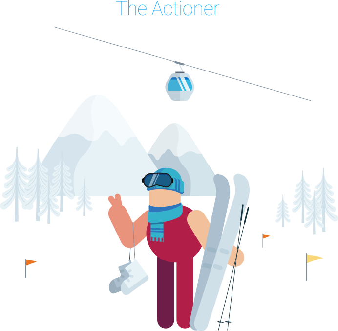
On the other hand, a user who is at the resort and about to start the action, is likely to be more interested in the current weather condition, the trails map, and the available lifts.
The Idea
The main idea is to reorder the different sections of the UI based on the user types. As well as to automatically show two different themes of the app based on the current season.
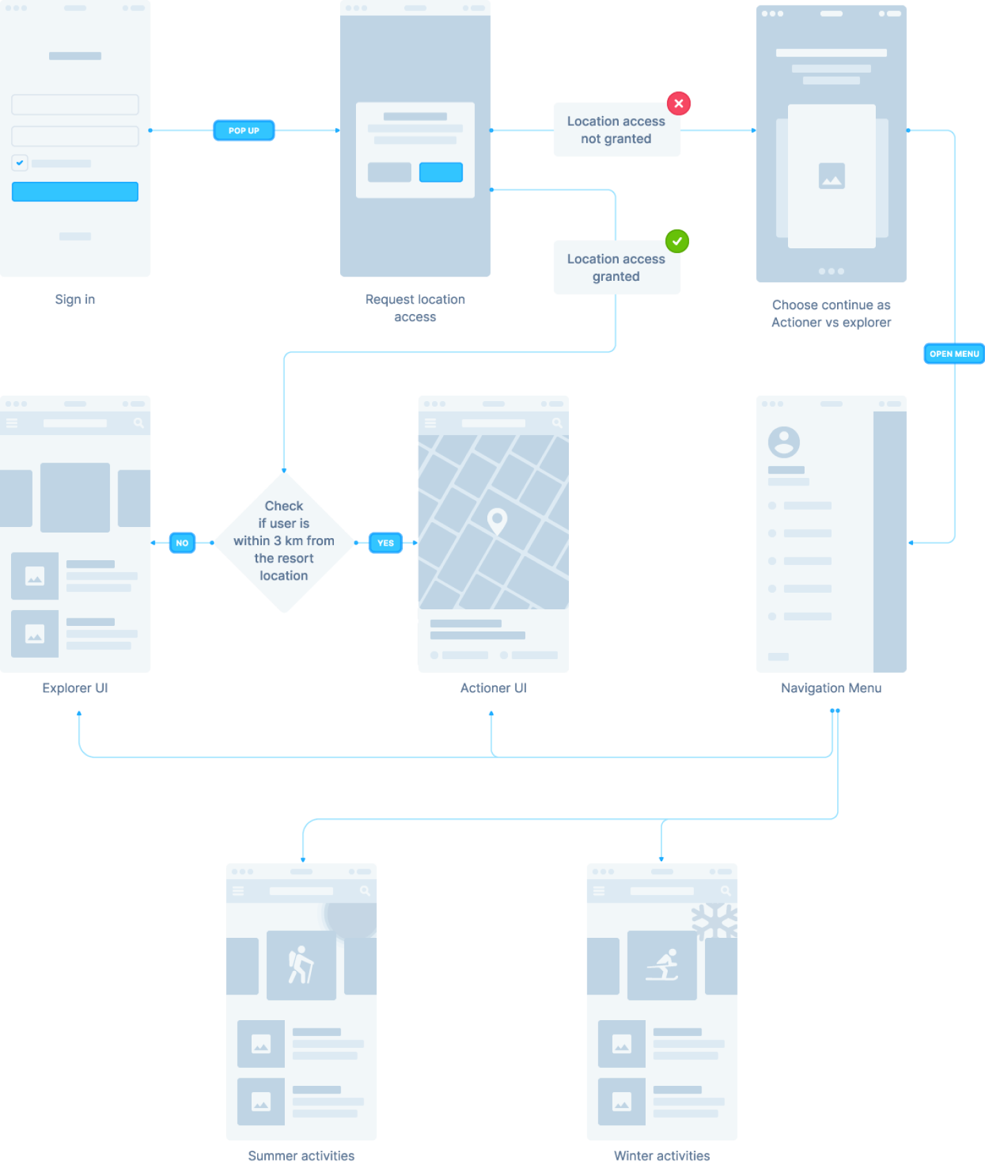
The app will switch between the winter and summer theme automatically, and show the associated activities and services of each theme. Also, The app will ask the users to access their location and show different UI based on how close they are to the resort.
A user who is more than 3 kilometers away from the station will see a UI that prioritizes the explorer-related sections. Once the App detects that the current location of the user is 3 km or less, the UI will change automatically to prioritize the suitable sections.
The Design
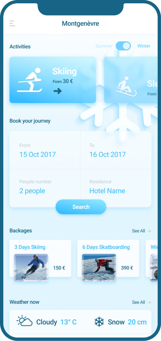
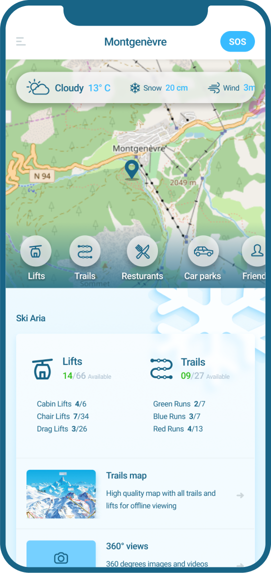
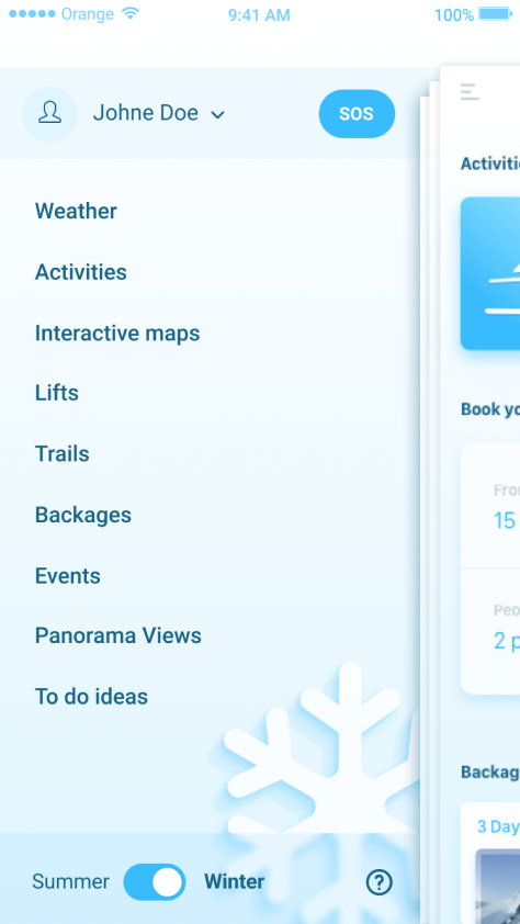
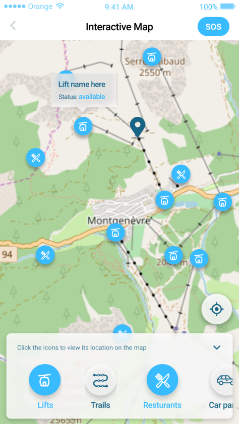
All sections are accessible for the two different variations of the UI. The difference is just a matter of ordering the content within each variation. Also, the two different themes are accessible through the main navigation as well.
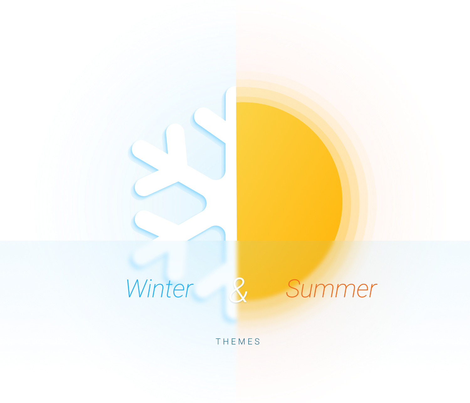
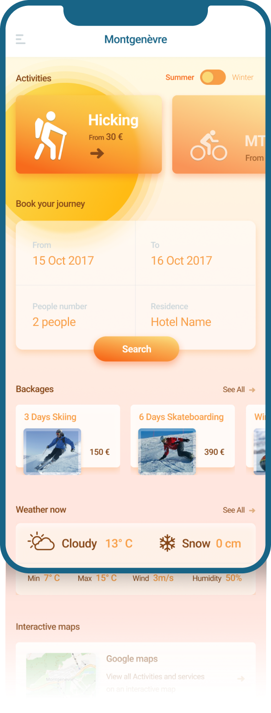
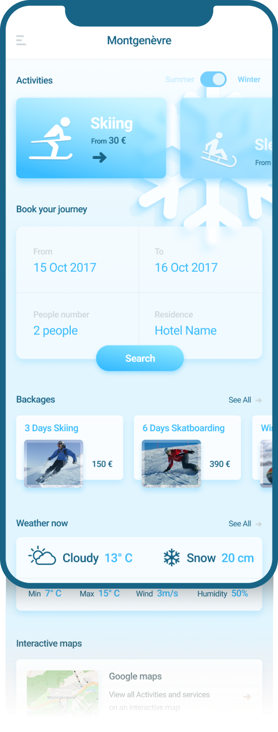
Two different themes for the same interface are automatically triggered based on the current time. This reflects the vibes of the season, as well as differentiates between the different activities for each season in a pleasant way.
Explorer VS Actioner
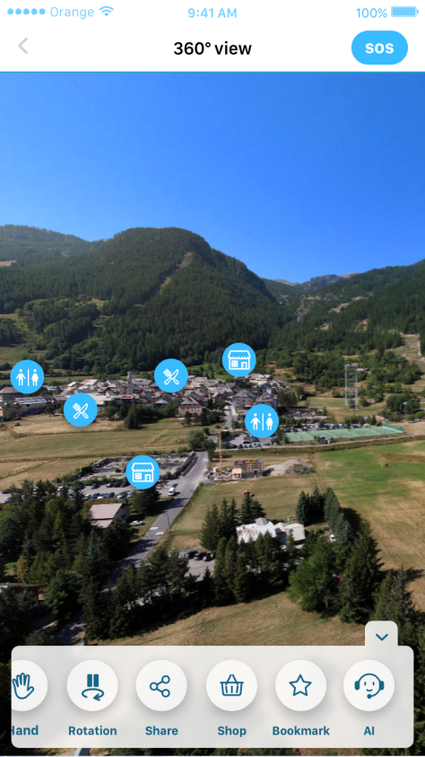
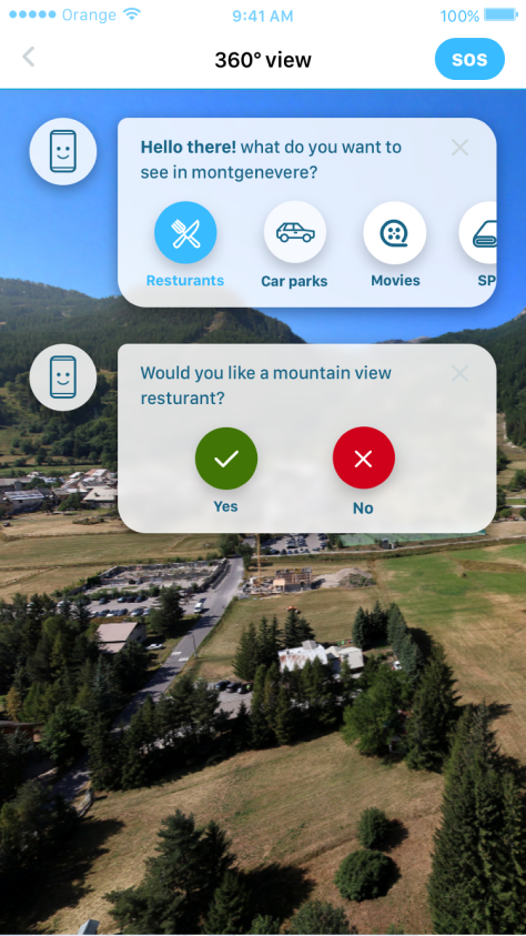
The main differences is between showing the activities and booking at the top for explorer, and showing the weather and the trails map & status at the top for the Actioner, in addition to the easy access for the SOS button in the header.
Illustrations
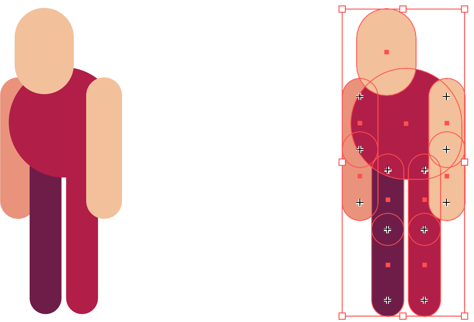
A simple character is illustrated in a way that makes it animation-friendly, to be able to create animation for the transition between the Actioner and the Explorer options.
Other illustrations has been created for the surrounding environment elements to show the main difference between the two options.
